Rachel's Rabbits
Specialty rabbit sitter and boarding on Long Island, NY. Offers an affordable and more personalized alternative to expensive, corporate-owned pet boarding facilities.
Challenge
Existing website had low contrast, and needed to display a lot of information in a clear layout. Client also wanted to improve web traffic and SEO performance.
Services
Results
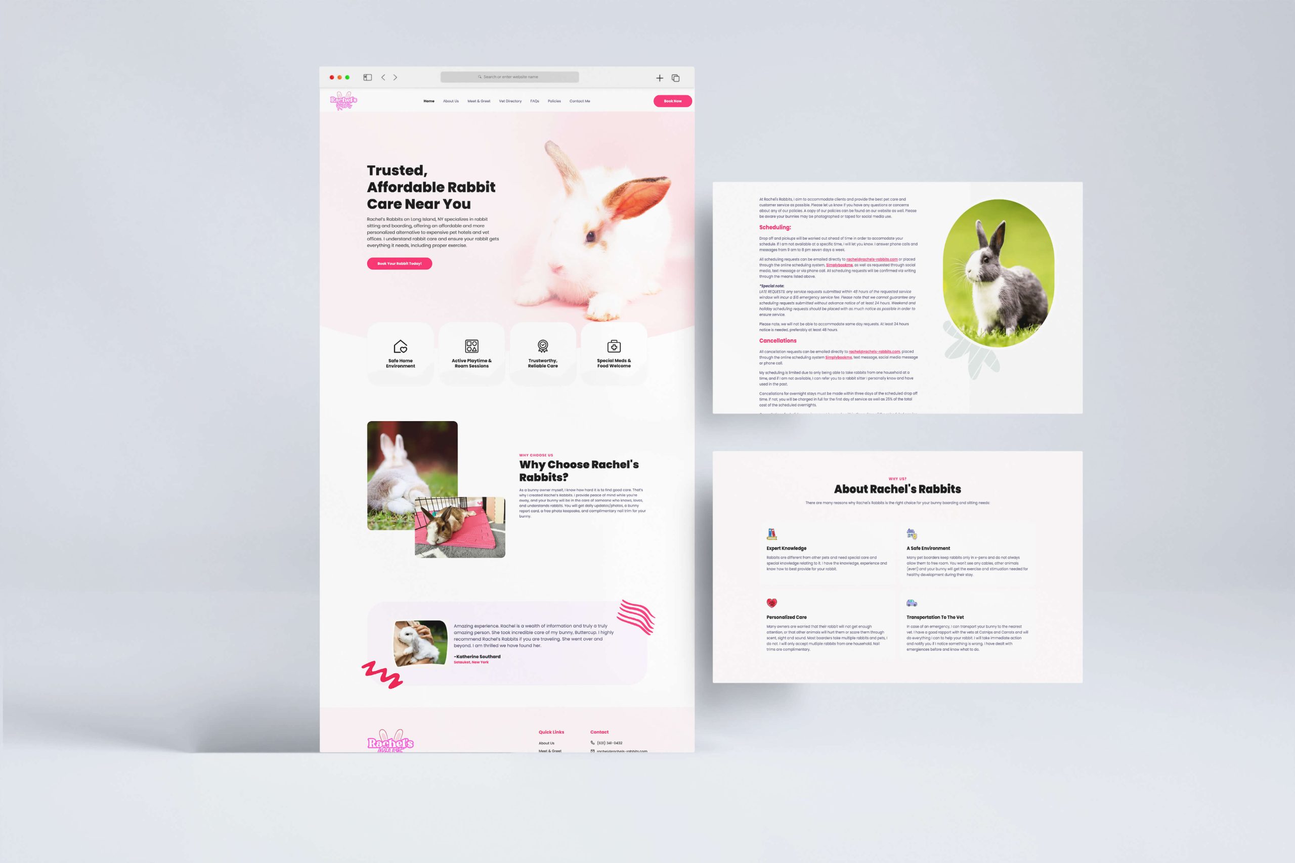
Refreshed site design to be much more accessible while maintaining brand colors, laid out information in a clear, easy-to-read format, and improved site performance and SEO.
Summary
Rachel’s Rabbits had an existing website but felt there was room for improvement in terms of design, branding, and overall performance.
Assessing the work
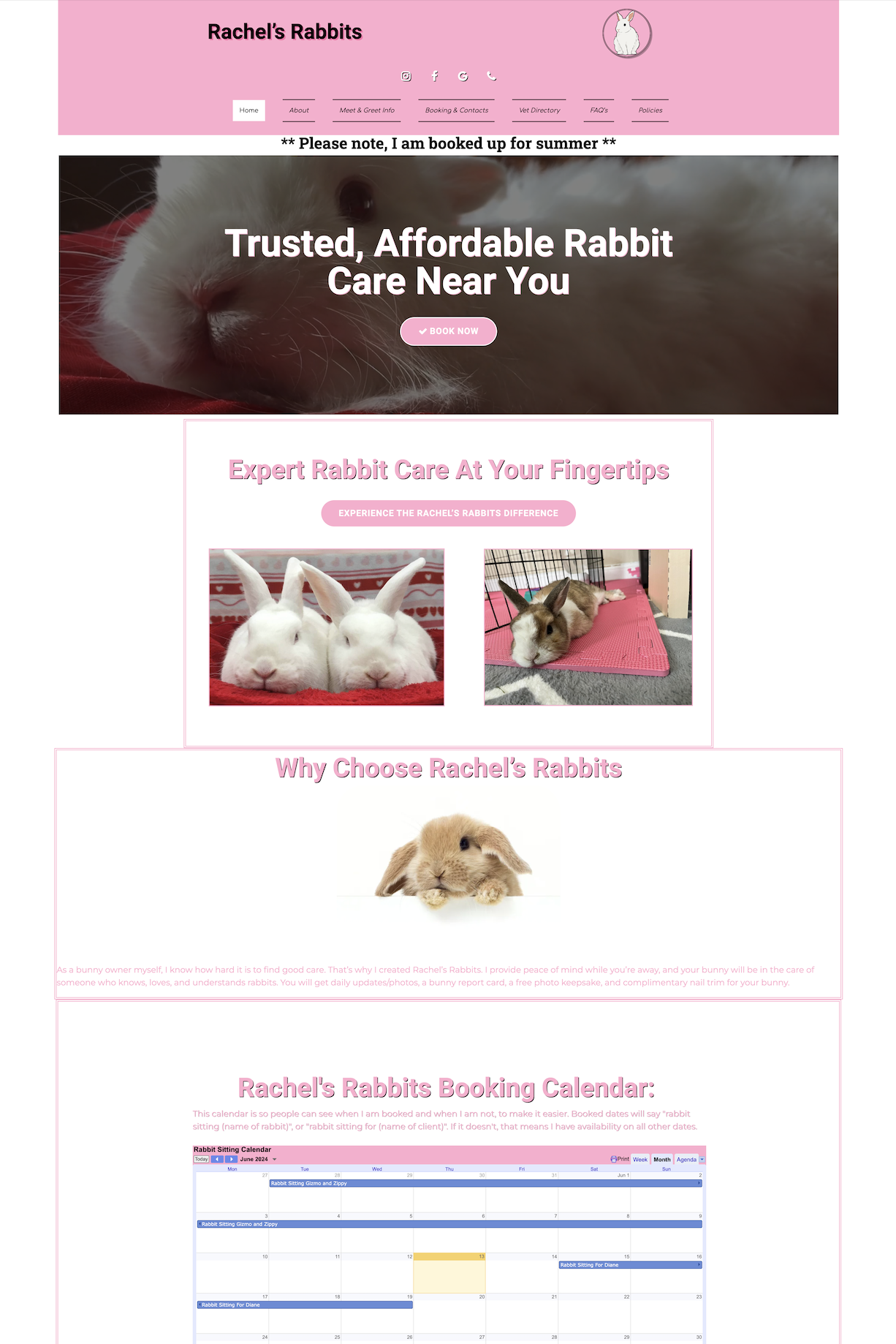
The existing website was already generating leads, but there were some areas for improvement:
- • Contrast made some text a bit hard to read
- • Large images caused slow load speeds on mobile devices
- • Lots of information, but no existing hierarchy for typography
- • SEO was light due to lack of long tail keywords
Revamped website with an emphasis on relevant keywords and readability
As pink is the primary brand color for Rachel’s Rabbits, we decided to still maintain that color scheme throughout the page but with dark text to increase contrast and readability. Splashes of pink, white, and light lavender colors allowed the site to come to life while still delivering information in a comfortable environment for site visitors.
Services and boarding features were highlighted with big icons and card styles, while forms were given more contrast and spacing to reduce eye-strain. New images were used throughout, and downsized, compressed, and optimized even further to reduce load times.
"Super communicative, amazingly fast turnaround time, quality work and now I have a website I can be proud of."
Rachel B.Owner, Rachel's Rabbits


